
CONSCEPT ENGAGEMENT ASSESSMENT
A clearer view of the work ahead.
A practical record of the complexity observed, the activities likely to help, and the work that was actually conducted.
Complexity profile
A complex legacy-modernisation programme delivered within strict technical and scope constraints. The work had to improve the current product experience while introducing reusable foundations that could support wider organisational change and future delivery.
Likely engagement
Discovery workshops
Not completedDriving requirementDiscovery Complexity
A facilitated working session to align perspectives, make decisions, and agree the next action.
Stakeholder mapping
CompleteDriving requirementOrganisational Complexity
Made relationships, dependencies, and gaps visible so the team could prioritise the right intervention.
Enterprise architecture assessment
CompleteDriving requirementProduct and Technical Complexity
Examined the current experience and evidence to identify risks, duplication, and opportunities for improvement.
Formal change-management plan
CompleteDriving requirementChange and Adoption Complexity
A focused activity to reduce uncertainty, support better decisions, and move the engagement forward.
Pilot and phased rollout
CompleteDriving requirementChange and Adoption Complexity · Risk and Uncertainty
A focused activity to reduce uncertainty, support better decisions, and move the engagement forward.
Programme plan
CompleteDriving requirementDelivery Complexity
A focused activity to reduce uncertainty, support better decisions, and move the engagement forward.
(+ 55 activities were included in this project)
A temporary fix with long-term consequences
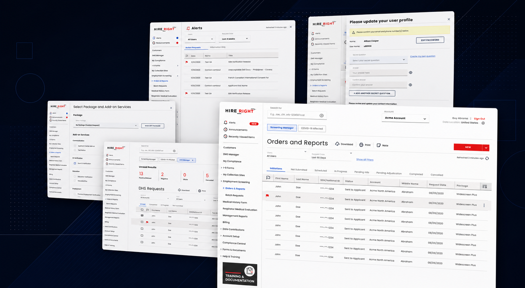
The improvement of Screening Manager was commissioned as a focused UI modernisation to address immediate client concerns. A separate project was planned to re-imagine the entire experience from the ground up.
Because the modernisation was considered temporary, the team was asked to preserve the existing workflow and avoid broader UX changes.
The challenge was to improve the product meaningfully without requiring structural re-engineering.
“Temporary work can become a strategic opportunity when it is designed to generate evidence, not just meet a deadline.”

The problem was bigger than the interface
Screening Manager ran on a highly complicated and outdated architecture. Client concerns were increasing, but the product could not be rebuilt from scratch within the available scope.
The immediate issues included:
Inconsistent visual patterns
Difficult-to-follow navigation
Redundant interface behaviour
Accessibility gaps
Unclear hierarchy
A growing cost of change
The project brief focused on visual modernisation, but the underlying problem was the growing effort required to make even small improvements safely and consistently.
Finding leverage inside a narrow brief
Rather than treating the project as disposable, I used it as a controlled pilot for reusable components and patterns.
The work followed two tracks:
Deliver the approved UI modernisation
Generate evidence for a broader design-system approach
The second track did not expand the project into a redesign. It changed how the agreed work was delivered, making the immediate output more reusable and measurable.
“The mandate limited what we could change. It did not limit the quality of the decisions we could make.”
function LegacyModernisationComparison() {
  const [position, setPosition] = useState(50);
  const [selected, setSelected] = useState("hierarchy");
  const points = {
    hierarchy: { label: "Improved hierarchy", detail: "The redesigned view makes the primary task, supporting actions, filters, and data table read as one clear sequence." },
    navigation: { label: "Updated navigation", detail: "A simpler navigation model makes frequently used areas visible and reduces the effort of finding the right workflow." },
    components: { label: "Consistent components", detail: "Shared controls replace one-off versions, so states and behaviour stay predictable across the product." },
    accessibility: { label: "Accessibility improvements", detail: "Clearer focus, contrast, sizing, and state feedback make the interface easier to use with different abilities and input methods." }
  };
  const active = points[selected];
  return (
    <section style={{ width: "100%", boxSizing: "border-box", padding: "clamp(22px, 4vw, 48px)", background: "#11161F", color: "#FFF", borderRadius: "12px", fontFamily: "Inter, Arial, sans-serif" }}>
      <div style={{ maxWidth: "1000px", margin: "0 auto" }}>
        <div style={{ marginBottom: "24px" }}>
          <p style={{ margin: "0 0 10px", color: "#FF8A66", fontSize: "11px", fontWeight: 700, letterSpacing: "0.14em" }}>BEFORE → AFTER</p>
          <h2 style={{ margin: "0 0 10px", maxWidth: "700px", fontSize: "clamp(28px, 5vw, 54px)", lineHeight: 1.04, letterSpacing: "-0.04em" }}>From fragmented controls to a shared system</h2>
          <p style={{ margin: 0, maxWidth: "680px", color: "#C8CCD0", fontSize: "16px", lineHeight: 1.55 }}>Drag the comparison to see the actual legacy and modernised interfaces side by side.</p>
        </div>
        <div style={{ position: "relative", overflow: "hidden", aspectRatio: "5760 / 3676", borderRadius: "10px", border: "1px solid #3B4552", background: "#FFF" }}>
          <img src="/uploads/legacy-dashboard-after.png" alt="Modernised Screening Manager interface" style={{ position: "absolute", inset: 0, width: "100%", height: "100%", objectFit: "cover", display: "block" }} />
          <img src="/uploads/legacy-dashboard-before.png" alt="Legacy Screening Manager interface" style={{ position: "absolute", inset: 0, width: "100%", height: "100%", objectFit: "cover", display: "block", clipPath: "inset(0 " + (100 - position) + "% 0 0)" }} />
          <div style={{ position: "absolute", top: "14px", left: "14px", padding: "7px 10px", background: "#11161F", color: "#FFF", fontSize: "11px", fontWeight: 700, letterSpacing: "0.12em" }}>LEGACY</div>
          <div style={{ position: "absolute", top: "14px", right: "14px", padding: "7px 10px", background: "#FF8A66", color: "#11161F", fontSize: "11px", fontWeight: 700, letterSpacing: "0.12em" }}>MODERNISED</div>
          <input aria-label="Compare legacy and modernised interface" type="range" min="0" max="100" value={position} onChange={(event) => setPosition(Number(event.target.value))} style={{ position: "absolute", inset: 0, width: "100%", height: "100%", opacity: 0, cursor: "ew-resize" }} />
          <div style={{ position: "absolute", top: "50%", left: "calc(" + position + "% - 20px)", width: "40px", height: "40px", borderRadius: "50%", background: "#FF8A66", color: "#11161F", display: "flex", alignItems: "center", justifyContent: "center", fontSize: "18px", fontWeight: 700, pointerEvents: "none" }}>↔</div>
        </div>
        <div style={{ marginTop: "24px" }}>
          <p style={{ margin: "0 0 10px", color: "#FF8A66", fontSize: "11px", fontWeight: 700, letterSpacing: "0.14em" }}>WHAT WE DID</p>
          <div style={{ display: "flex", flexWrap: "wrap", gap: "8px" }}>
            {Object.entries(points).map(([key, point]) => <button key={key} type="button" onClick={() => setSelected(key)} style={{ flex: "1 1 150px", padding: "12px 14px", border: selected === key ? "2px solid #FF8A66" : "1px solid #3B4552", borderRadius: "7px", background: selected === key ? "#202936" : "#191F29", color: selected === key ? "#FF8A66" : "#FFF", textAlign: "left", fontSize: "13px", fontWeight: 700, cursor: "pointer" }}>{point.label}</button>)}
          </div>
        </div>
        <div style={{ marginTop: "14px", padding: "18px 20px", borderLeft: "3px solid #FF8A66", background: "#191F29" }}>
          <p style={{ margin: "0 0 5px", color: "#FF8A66", fontSize: "11px", fontWeight: 700, letterSpacing: "0.12em" }}>PROBLEM SOLVED</p>
          <p style={{ margin: 0, color: "#FFF", fontSize: "15px", lineHeight: 1.55 }}>{active.detail}</p>
        </div>
      </div>
    </section>
  );
}
render(<LegacyModernisationComparison />);

Measuring impact beyond the interface
The project created measurable value for both the product and the organisation.
Across the first 12 weeks after launch:
75% fewer client complaints
£560K in customer support cost savings
4.2/5 client satisfaction
The modernisation also:
Became the first live ReVolve adoption
Created evidence for executive approval
Reduced duplicated design and development effort
Established a repeatable model for future teams
function OutcomeDashboard() {
  const [open, setOpen] = useState("complaints");
  const metrics = {
    complaints: { value: "−75%", label: "Client complaints", period: "First 12 weeks after launch", changed: "A clearer hierarchy, navigation model, and more consistent states reduced avoidable confusion in the live product.", connection: "The modernisation focused effort on the highest-friction moments, then carried the resulting patterns into reusable components." },
    savings: { value: "£560K", label: "Support cost savings", period: "First 12 weeks after launch", changed: "Fewer recurring issues and clearer task completion reduced the support effort associated with the previous interface.", connection: "The work made high-value improvements within the existing architecture, creating measurable operational value without a rebuild." },
    satisfaction: { value: "4.2/5", label: "Client satisfaction", period: "Post-launch client feedback", changed: "The updated experience gave clients a more predictable way to complete tasks and understand what would happen next.", connection: "Consistent components and accessible interaction states turned design decisions into a more dependable product experience." }
  };
  const active = metrics[open];
  return (
    <section style={{ width: "100%", boxSizing: "border-box", padding: "clamp(24px, 4vw, 52px)", background: "#11161F", color: "#FFF", borderRadius: "12px", fontFamily: "Inter, Arial, sans-serif" }}>
      <div style={{ maxWidth: "1000px", margin: "0 auto" }}>
        <p style={{ margin: "0 0 10px", color: "#FF8A66", fontSize: "11px", fontWeight: 700, letterSpacing: "0.14em" }}>OUTCOME DASHBOARD</p>
        <h2 style={{ margin: "0 0 10px", maxWidth: "700px", fontSize: "clamp(28px, 5vw, 54px)", lineHeight: 1.04, letterSpacing: "-0.04em" }}>Impact beyond the interface</h2>
        <p style={{ margin: "0 0 26px", maxWidth: "680px", color: "#C8CCD0", fontSize: "16px", lineHeight: 1.55 }}>Select an outcome to see the evidence, the change behind it, and how it connected to the design work.</p>
        <div style={{ display: "grid", gridTemplateColumns: "repeat(3, minmax(0, 1fr))", gap: "12px" }}>
          {Object.entries(metrics).map(([key, metric]) => <button key={key} type="button" onClick={() => setOpen(key)} aria-expanded={open === key} style={{ padding: "22px", minHeight: "150px", border: open === key ? "2px solid #FF8A66" : "1px solid #3B4552", borderRadius: "9px", background: open === key ? "#202936" : "#191F29", color: "#FFF", textAlign: "left", cursor: "pointer", transform: open === key ? "translateY(-3px)" : "none", transition: "transform 160ms ease, border-color 160ms ease" }}><strong style={{ display: "block", marginBottom: "16px", color: "#FF8A66", fontSize: "clamp(30px, 4vw, 46px)", lineHeight: 1 }}>{metric.value}</strong><span style={{ display: "block", fontSize: "14px", fontWeight: 700 }}>{metric.label}</span><span style={{ display: "block", marginTop: "12px", color: "#AAB2BC", fontSize: "11px" }}>{open === key ? "OPEN · VIEW DETAILS" : "VIEW DETAILS"}</span></button>)}
        </div>
        <div style={{ marginTop: "14px", padding: "22px", borderLeft: "3px solid #FF8A66", background: "#191F29" }}>
          <p style={{ margin: "0 0 14px", color: "#FF8A66", fontSize: "11px", fontWeight: 700, letterSpacing: "0.12em" }}>{active.label.toUpperCase()}</p>
          <div style={{ display: "grid", gridTemplateColumns: "repeat(3, minmax(0, 1fr))", gap: "22px" }}>
            <div><strong style={{ display: "block", marginBottom: "6px", fontSize: "12px" }}>Measurement period</strong><p style={{ margin: 0, color: "#C8CCD0", fontSize: "14px", lineHeight: 1.5 }}>{active.period}</p></div>
            <div><strong style={{ display: "block", marginBottom: "6px", fontSize: "12px" }}>What changed</strong><p style={{ margin: 0, color: "#C8CCD0", fontSize: "14px", lineHeight: 1.5 }}>{active.changed}</p></div>
            <div><strong style={{ display: "block", marginBottom: "6px", fontSize: "12px" }}>Connection to the work</strong><p style={{ margin: 0, color: "#C8CCD0", fontSize: "14px", lineHeight: 1.5 }}>{active.connection}</p></div>
          </div>
        </div>
      </div>
    </section>
  );
}
render(<OutcomeDashboard />);
From pilot to organisational change
Screening Manager demonstrated that a narrow project can still create strategic value.
The work improved the live product, but it also changed the conversation around design systems. Reusable components were no longer an individual recommendation. They had become a practical delivery capability with visible evidence behind them.
The pilot helped secure approval for ReVolve as a broader organisational initiative.
“The pilot data turned a component experiment into an approved programme: a design system funded on evidence rather than advocacy.”

Reflection
Screening Manager showed that modernisation does not have to mean choosing between immediate delivery and long-term thinking.
By working within a strict UI-only mandate, I was able to:
Improve the live experience
Prioritise high-impact changes
Introduce reusable patterns
Reduce complaints and support costs
Create evidence for wider investment
Help establish a repeatable design-system adoption model
The most important outcome was not simply that the interface looked newer.
It was that a temporary project became a durable foundation for how the organisation could design, build, and improve products in the future.