
CONSCEPT ENGAGEMENT ASSESSMENT
A clearer view of the work ahead.
A practical record of the complexity observed, the activities likely to help, and the work that was actually conducted.
Complexity profile
Likely engagement
Discovery workshops
CompleteDriving requirementDiscovery Complexity
A facilitated working session to align perspectives, make decisions, and agree the next action.
Stakeholder mapping
CompleteDriving requirementOrganisational Complexity
Made relationships, dependencies, and gaps visible so the team could prioritise the right intervention.
Multi-platform architecture audit
CompleteDriving requirementProduct and Technical Complexity
Examined the current experience and evidence to identify risks, duplication, and opportunities for improvement.
Change-impact assessment
CompleteDriving requirementChange and Adoption Complexity
Examined the current experience and evidence to identify risks, duplication, and opportunities for improvement.
Pilot and phased rollout
CompleteDriving requirementChange and Adoption Complexity · Risk and Uncertainty
A focused activity to reduce uncertainty, support better decisions, and move the engagement forward.
Programme plan
CompleteDriving requirementDelivery Complexity
A focused activity to reduce uncertainty, support better decisions, and move the engagement forward.
(+ 52 activities were included in this project)
The real problem was between the steps
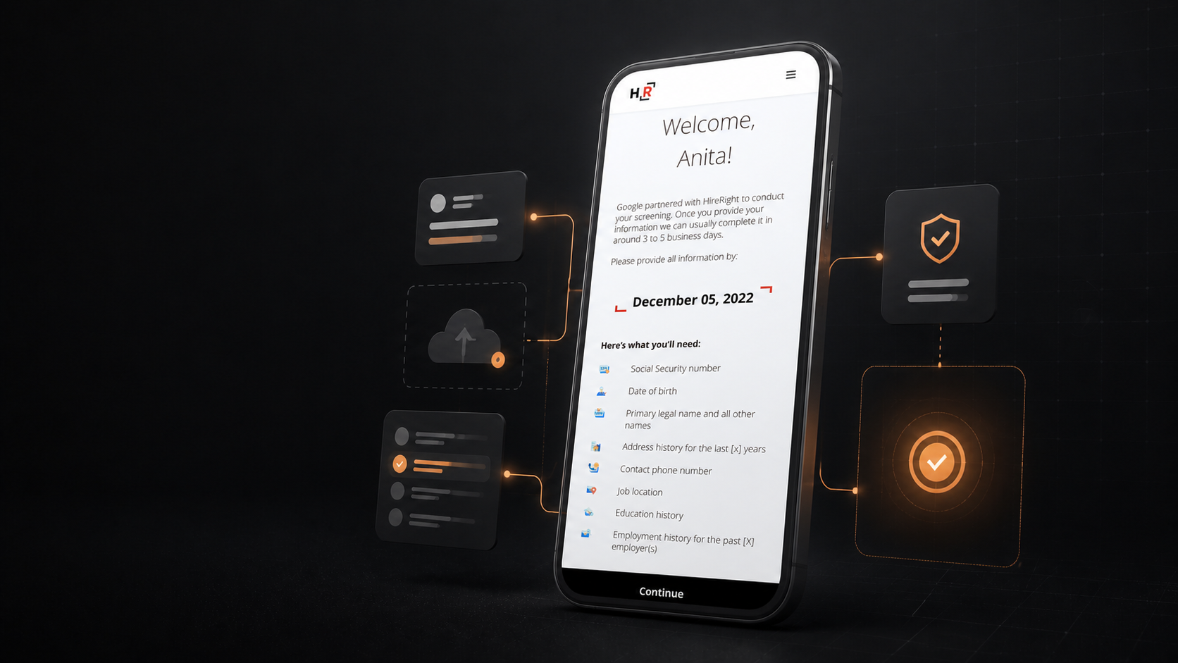
Applicant Center supported a sensitive, multi-step candidate journey: providing personal information, completing required tasks, uploading documents, and waiting for decisions.
The individual screens were functional. The problem was that the experience did not consistently explain what was happening between them.
Candidates were left asking:
How much of the process is left?
Did my document upload successfully?
Why am I being asked for this information?
What happens after I submit?
Can I safely leave and return later?
These gaps created uncertainty at precisely the moments when confidence mattered most.
“The journey worked. The joins between the steps did not.”
Starting with the problems candidates actually needed solved
As one of two designers on the project, I focused on the underlying journey rather than treating each screen as an isolated UI problem.
We mapped the experience around four recurring failure points:
Repeated or unnecessary information requests
Progress indicators that did not reflect the real process
Status changes that were invisible to candidates
Weak recovery paths when something went wrong
This reframed the work from “make the interface more modern” to:
Make the system explain itself at every important handoff.

Designing for the smallest, most demanding context
We treated mobile as the primary design constraint rather than a reduced version of desktop.
This forced important questions early:
Can the task be completed comfortably with one hand?
Is the next action obvious without scanning the whole screen?
Can the user understand the current state at a glance?
Can progress be resumed after an interruption?
Are errors actionable rather than merely descriptive?
The mobile-first approach helped expose problems that were easy to overlook on larger screens. If a flow only worked when there was plenty of room, it was not yet simple enough.
“Mobile was not a breakpoint. It was a pressure test for the whole experience.”
function ApplicationProgress() {
  const [selectedStep, setSelectedStep] = useState(2);
  const [expandedStep, setExpandedStep] = useState(null);

  const steps = [
    {
      label: "Personal details",
      status: "complete",
      explanation: "Your personal information has been received and saved.",
      next: "Your application is ready for document review.",
    },
    {
      label: "Upload documents",
      status: "complete",
      explanation: "Your required documents have been uploaded successfully.",
      next: "The documents will now be checked.",
    },
    {
      label: "Application review",
      status: "current",
      explanation: "Our team is reviewing your application and may contact you if anything is missing.",
      next: "Review usually takes 1–3 working days.",
    },
    {
      label: "Additional information",
      status: "waiting",
      explanation: "This step will become available if the review team needs more information.",
      next: "You will receive a notification if action is needed.",
    },
    {
      label: "Decision",
      status: "error",
      explanation: "We could not complete this step because additional information is required.",
      next: "Check your messages and provide the missing information.",
    },
  ];

  const selected = steps[selectedStep];

  const statusLabel = {
    complete: "Completed",
    current: "In progress",
    waiting: "Waiting",
    error: "Action needed",
  };

  const statusColor = {
    complete: "#8FD3B6",
    current: "#FF8A66",
    waiting: "#AAB2BC",
    error: "#FF8A66",
  };

  return (
    <section
      style={{
        width: "100%",
        boxSizing: "border-box",
        padding: "clamp(24px, 5vw, 56px)",
        background: "#11161F",
        color: "#FFFFFF",
        fontFamily: "Inter, Arial, sans-serif",
        borderRadius: "12px",
      }}
    >
      <div style={{ maxWidth: "760px", margin: "0 auto" }}>
        <div style={{ marginBottom: "36px" }}>
          <div
            style={{
              marginBottom: "12px",
              color: "#FF8A66",
              fontSize: "12px",
              fontWeight: 700,
              letterSpacing: "0.14em",
            }}
          >
            APPLICATION PROGRESS
          </div>

          <h2
            style={{
              margin: "0 0 12px",
              fontSize: "clamp(28px, 5vw, 52px)",
              lineHeight: 1.05,
              letterSpacing: "-0.04em",
            }}
          >
            Your application, explained
          </h2>

          <p
            style={{
              maxWidth: "620px",
              margin: 0,
              color: "#C8CCD0",
              fontSize: "16px",
              lineHeight: 1.6,
            }}
          >
            Every step has a visible status, a clear explanation, and an
            answer to what happens next.
          </p>
        </div>

        <div
          style={{
            display: "grid",
            gap: "12px",
          }}
        >
          {steps.map((step, index) => {
            const isSelected = selectedStep === index;
            const isExpanded = expandedStep === index;
            const color = statusColor[step.status];

            return (
              <div
                key={step.label}
                style={{
                  border: isSelected
                    ? "2px solid #FF8A66"
                    : "1px solid #303844",
                  borderRadius: "10px",
                  background: isSelected ? "#202936" : "#191F29",
                  overflow: "hidden",
                }}
              >
                <button
                  type="button"
                  onClick={() => setSelectedStep(index)}
                  style={{
                    display: "flex",
                    alignItems: "center",
                    gap: "16px",
                    width: "100%",
                    padding: "18px",
                    border: 0,
                    background: "transparent",
                    color: "#FFFFFF",
                    textAlign: "left",
                    cursor: "pointer",
                  }}
                >
                  <span
                    style={{
                      display: "grid",
                      placeItems: "center",
                      width: "32px",
                      height: "32px",
                      flexShrink: 0,
                      borderRadius: "50%",
                      background: color,
                      color: "#11161F",
                      fontSize: "14px",
                      fontWeight: 800,
                    }}
                  >
                    {step.status === "complete"
                      ? "✓"
                      : step.status === "error"
                        ? "!"
                        : index + 1}
                  </span>

                  <span style={{ flex: 1 }}>
                    <strong
                      style={{
                        display: "block",
                        marginBottom: "4px",
                        fontSize: "16px",
                      }}
                    >
                      {step.label}
                    </strong>

                    <span
                      style={{
                        color,
                        fontSize: "12px",
                        fontWeight: 700,
                        letterSpacing: "0.08em",
                        textTransform: "uppercase",
                      }}
                    >
                      {statusLabel[step.status]}
                    </span>
                  </span>

                  <span
                    style={{
                      color: "#AAB2BC",
                      fontSize: "20px",
                      transform: isSelected ? "rotate(90deg)" : "none",
                    }}
                  >
                    →
                  </span>
                </button>

                {isSelected && (
                  <div
                    style={{
                      padding: "0 18px 18px 66px",
                      color: "#C8CCD0",
                      fontSize: "14px",
                      lineHeight: 1.6,
                    }}
                  >
                    <p style={{ margin: "0 0 12px" }}>
                      {step.explanation}
                    </p>

                    <button
                      type="button"
                      onClick={() =>
                        setExpandedStep(isExpanded ? null : index)
                      }
                      style={{
                        padding: 0,
                        border: 0,
                        background: "transparent",
                        color: "#FF8A66",
                        fontSize: "13px",
                        fontWeight: 700,
                        cursor: "pointer",
                      }}
                    >
                      {isExpanded ? "Hide details" : "What happens next?"}
                    </button>

                    {isExpanded && (
                      <div
                        style={{
                          marginTop: "12px",
                          padding: "14px",
                          borderLeft: "3px solid #FF8A66",
                          background: "#11161F",
                          color: "#FFFFFF",
                        }}
                      >
                        {step.next}
                      </div>
                    )}
                  </div>
                )}
              </div>
            );
          })}
        </div>

        <div
          style={{
            display: "flex",
            alignItems: "flex-start",
            gap: "12px",
            marginTop: "28px",
            padding: "18px",
            borderRadius: "10px",
            background: "#FF8A66",
            color: "#11161F",
          }}
        >
          <span style={{ fontSize: "18px", fontWeight: 800 }}>→</span>
          <div>
            <strong style={{ display: "block", marginBottom: "4px" }}>
              Next step: {selected.label}
            </strong>
            <span style={{ fontSize: "14px", lineHeight: 1.5 }}>
              {selected.next}
            </span>
          </div>
        </div>
      </div>
    </section>
  );
}

render(<ApplicationProgress />);
Turning invisible system states into visible feedback
A major part of the work was making the system’s internal state legible to candidates.
Instead of showing only a completed form or a generic confirmation, each important action received a clear response:
Information received
Document uploaded
Verification in progress
Action required
Submission complete
Waiting for the next stage
The experience became easier to understand because each transition had a visible receipt.
“No important action should end in silence.”

Reducing friction without reducing reassurance
The solution was not simply to remove steps. Some information was necessary because of the operational and compliance requirements behind the experience.
The goal was to make the reason, timing, and consequence of each request clearer.
Where information already existed, the experience could confirm it rather than ask the candidate to enter it again. Where a task could be deferred, it was separated from the immediate flow. Where a delay was unavoidable, the interface explained what was happening.
This allowed the experience to remain thorough without feeling unnecessarily difficult.
Creating a system that could scale beyond one journey
The redesign introduced patterns that could be reused across the broader Applicant Center experience:
Consistent progress communication
Shared validation behaviour
Repeatable upload states
Clear recovery patterns
Mobile-first form structures
Standardised confirmation and waiting states
The value was not only in improving one sequence. It was in creating a more coherent language for future journeys.
function CandidateTaskExplorer() {
  const [state, setState] = useState("default");
  const [mobile, setMobile] = useState(false);
  const [value, setValue] = useState("");

  const isError = state === "error";
  const isSuccess = state === "success";
  const isDisabled = state === "disabled";
  const isFocused = state === "focus";

  const orange = "#FF8A66";
  const dark = "#11161F";
  const surface = "#1F2633";
  const muted = "#C8CCD0";
  const border = "#3B4552";

  const borderColor = isError
    ? orange
    : isFocused
      ? orange
      : isSuccess
        ? "#8FD3B6"
        : border;

  return (
    <section
      style={{
        width: "100%",
        boxSizing: "border-box",
        padding: "clamp(24px, 5vw, 56px)",
        background: dark,
        color: "#FFFFFF",
        fontFamily: "Inter, Arial, sans-serif",
        borderRadius: "12px",
      }}
    >
      <div
        style={{
          maxWidth: "980px",
          margin: "0 auto",
        }}
      >
        <div style={{ marginBottom: "32px" }}>
          <div
            style={{
              marginBottom: "12px",
              color: orange,
              fontSize: "12px",
              fontWeight: 700,
              letterSpacing: "0.14em",
            }}
          >
            DESIGN SYSTEM EXPLORER
          </div>

          <h2
            style={{
              maxWidth: "680px",
              margin: "0 0 12px",
              fontSize: "clamp(28px, 5vw, 52px)",
              lineHeight: 1.05,
              letterSpacing: "-0.04em",
            }}
          >
            One task, five useful states
          </h2>

          <p
            style={{
              maxWidth: "680px",
              margin: 0,
              color: muted,
              fontSize: "16px",
              lineHeight: 1.6,
            }}
          >
            The same component adapts to the user’s context without changing
            its underlying behaviour.
          </p>
        </div>

        <div
          style={{
            display: "flex",
            flexWrap: "wrap",
            gap: "8px",
            marginBottom: "28px",
          }}
        >
          {["default", "focus", "error", "success", "disabled"].map(
            (option) => (
              <button
                key={option}
                type="button"
                onClick={() => setState(option)}
                style={{
                  padding: "10px 14px",
                  border: state === option
                    ? `2px solid ${orange}`
                    : `1px solid ${border}`,
                  borderRadius: "999px",
                  background: state === option ? orange : surface,
                  color: state === option ? dark : "#FFFFFF",
                  fontSize: "13px",
                  fontWeight: 700,
                  textTransform: "capitalize",
                  cursor: "pointer",
                }}
              >
                {option}
              </button>
            )
          )}

          <button
            type="button"
            onClick={() => setMobile(!mobile)}
            style={{
              marginLeft: "auto",
              padding: "10px 14px",
              border: `1px solid ${border}`,
              borderRadius: "999px",
              background: mobile ? orange : surface,
              color: mobile ? dark : "#FFFFFF",
              fontSize: "13px",
              fontWeight: 700,
              cursor: "pointer",
            }}
          >
            {mobile ? "Mobile layout" : "Desktop layout"}
          </button>
        </div>

        <div
          style={{
            display: "flex",
            flexDirection: mobile ? "column" : "row",
            alignItems: "stretch",
            gap: "24px",
          }}
        >
          <div
            style={{
              flex: 1,
              maxWidth: mobile ? "390px" : "none",
              padding: "24px",
              border: `1px solid ${border}`,
              borderRadius: "12px",
              background: surface,
            }}
          >
            <div
              style={{
                display: "flex",
                justifyContent: "space-between",
                gap: "16px",
                marginBottom: "24px",
              }}
            >
              <div>
                <div
                  style={{
                    marginBottom: "8px",
                    color: orange,
                    fontSize: "11px",
                    fontWeight: 700,
                    letterSpacing: "0.12em",
                  }}
                >
                  CURRENT TASK
                </div>

                <h3
                  style={{
                    margin: 0,
                    fontSize: "24px",
                    lineHeight: 1.15,
                  }}
                >
                  Upload your CV
                </h3>
              </div>

              <span
                style={{
                  display: "grid",
                  placeItems: "center",
                  width: "32px",
                  height: "32px",
                  flexShrink: 0,
                  borderRadius: "50%",
                  background: isSuccess ? "#8FD3B6" : orange,
                  color: dark,
                  fontWeight: 800,
                }}
              >
                {isSuccess ? "✓" : "2"}
              </span>
            </div>

            <label
              style={{
                display: "block",
                marginBottom: "8px",
                color: "#FFFFFF",
                fontSize: "14px",
                fontWeight: 700,
              }}
            >
              CV or résumé
            </label>

            <div
              style={{
                display: "flex",
                alignItems: "center",
                gap: "12px",
                padding: "14px",
                border: `2px solid ${borderColor}`,
                borderRadius: "8px",
                background: dark,
                boxShadow: isFocused
                  ? `0 0 0 4px rgba(255, 138, 102, 0.18)`
                  : "none",
                opacity: isDisabled ? 0.5 : 1,
              }}
            >
              <span
                style={{
                  display: "grid",
                  placeItems: "center",
                  width: "36px",
                  height: "36px",
                  flexShrink: 0,
                  borderRadius: "6px",
                  background: "rgba(255, 138, 102, 0.16)",
                  color: orange,
                  fontSize: "18px",
                }}
              >
                ↑
              </span>

              <input
                value={isSuccess ? "andreistanescu-cv.pdf" : value}
                disabled={isDisabled || isSuccess}
                onChange={(event) => setValue(event.target.value)}
                placeholder="Choose a file"
                aria-invalid={isError}
                aria-describedby="task-help task-error"
                style={{
                  minWidth: 0,
                  flex: 1,
                  border: 0,
                  outline: 0,
                  background: "transparent",
                  color: "#FFFFFF",
                  fontSize: "14px",
                }}
              />
            </div>

            <p
              id="task-help"
              style={{
                margin: "10px 0 0",
                color: muted,
                fontSize: "13px",
                lineHeight: 1.5,
              }}
            >
              PDF, DOC, or DOCX. Maximum file size: 10MB.
            </p>

            {isError && (
              <p
                id="task-error"
                style={{
                  margin: "10px 0 0",
                  color: orange,
                  fontSize: "13px",
                  fontWeight: 700,
                }}
              >
                Please upload a supported file before continuing.
              </p>
            )}

            {isSuccess && (
              <p
                style={{
                  margin: "10px 0 0",
                  color: "#8FD3B6",
                  fontSize: "13px",
                  fontWeight: 700,
                }}
              >
                Upload complete. Your document is ready for verification.
              </p>
            )}

            <button
              type="button"
              disabled={isDisabled}
              style={{
                width: "100%",
                minHeight: "48px",
                marginTop: "24px",
                border: 0,
                borderRadius: "8px",
                background: isDisabled ? "#56606D" : orange,
                color: dark,
                fontSize: "14px",
                fontWeight: 800,
                cursor: isDisabled ? "not-allowed" : "pointer",
              }}
            >
              {isSuccess ? "Uploaded" : "Continue"}
            </button>
          </div>

          <aside
            style={{
              flex: "0 1 320px",
              padding: "24px",
              borderLeft: `3px solid ${orange}`,
              borderRadius: "8px",
              background: "#191F29",
            }}
          >
            <div
              style={{
                marginBottom: "14px",
                color: orange,
                fontSize: "11px",
                fontWeight: 700,
                letterSpacing: "0.12em",
              }}
            >
              ACCESSIBILITY GUIDANCE
            </div>

            <ul
              style={{
                display: "grid",
                gap: "14px",
                margin: 0,
                paddingLeft: "18px",
                color: muted,
                fontSize: "14px",
                lineHeight: 1.55,
              }}
            >
              <li>Use a visible focus ring with sufficient contrast.</li>
              <li>Expose errors next to the field and through assistive technology.</li>
              <li>Keep the control usable with a keyboard.</li>
              <li>Use a minimum 48px touch target on mobile.</li>
              <li>Never communicate state through colour alone.</li>
            </ul>
          </aside>
        </div>
      </div>
    </section>
  );
}

render(<CandidateTaskExplorer />);
The outcome was more than a visual redesign
Applicant Center became easier to understand because the experience began to communicate the work happening behind the interface.
The redesign helped make progress visible, reduced ambiguity around submissions and handoffs, and gave the team a stronger foundation for handling complex candidate journeys consistently.
The most important shift was conceptual:
We stopped designing isolated screens and started designing the candidate’s understanding of the process.
