
I was in a conversation this week with a Jano Polacek and got asked something I hadn't been asked in quite a while:
"In your UX work, how do you usually know when a design is actually landing well with users?"
I had to think on my feet. My answer went something like: we start from a business target, we talk to users to understand where the problems are, we build the solution, we launch it, and we measure. Not wrong. It's more or less how the job works.
But it stayed with me for the rest of the day, because I don't think it's the whole answer...
Here's what kept nagging at me.
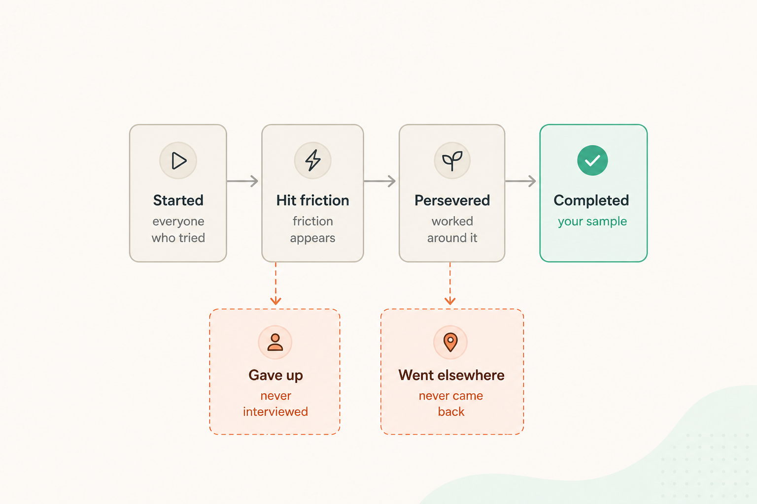
The users we talk to — the ones who reply to the recruitment email, who show up to the session, who are simply easier to reach — are overwhelmingly the users who completed the process. They pushed through whatever was in the way. For them the problem was real, but never big enough to stop them. They finished, so they're still in the database, still on the list, still willing to give us half an hour.
And then we build the next version of the product largely on what they tell us.
Which is when it struck me that this is the survivorship bias problem, almost exactly.
Wald's planes

By Martin Grandjean (vector), McGeddon (picture), US Air Force (hit plot concept) - Own work, CC BY-SA 4.0, https://commons.wikimedia.org/w/index.php?curid=102017718
The story comes from the Second World War. Allied bombers were returning from missions shot to pieces, and the question was where to add armour. Armour is heavy — you can't put it everywhere, so you have to choose. The sensible move was to examine the aircraft coming back and map where the damage clustered: wings, fuselage, tail. Obvious conclusion — reinforce where the holes are.
Abraham Wald, a statistician working with Columbia's Statistical Research Group, pointed out the flaw. The damage map wasn't a map of where planes get hit. It was a map of where a plane can get hit and still make it home. The engines and cockpit looked almost clean in the data — not because nobody shot at them, but because the planes hit there were at the bottom of the Channel, and nobody was measuring those.
So the recommendation inverted: armour the places with no holes.
That inversion is the part we tend to skip when we retell this story. The bias isn't just "you're missing some data." It's that the absence of a signal turned out to be the single most important signal in the dataset.
The same shape, in research

Our returning planes are the completed sessions. The finished onboarding, the submitted application, the closed ticket, the user who made it to the end and is now happy to tell us about the two mildly annoying things they encountered on the way.
Our missing planes are everyone who left. The person who abandoned the form at step three. The person who tried the new feature once, decided it wasn't for them, and quietly went back to the spreadsheet they were using before. The person who never got far enough into the product to be considered a user at all, and therefore never made it onto any list we recruit from.
Two entirely different situations. The same structural problem.
And it leads to the same trap. If the only feedback we hold is from people who survived a journey, then every part of that journey is — by definition — survivable. The friction our interviewees describe is, tautologically, friction that can be overcome. So we go and polish it. We put the armour where the holes are.
Meanwhile the screen that generates no complaints at all in our research sits there looking healthy. Maybe it is. Or maybe it's the cockpit — the place where getting hit means you don't come back to tell anyone about it.
Silence reads as health. It isn't necessarily.
So where are the missing planes?
This is the part I've been thinking hardest about, because "your sample is biased" is easy to say and useless on its own. The honest answer is that the non-completers do leave traces, just not in the places we usually look first:
Funnel drop-off data. Not as a vanity metric, but as a recruitment list. The cliff in the chart tells you which step to go and investigate.
Session recordings that end mid-task. The ones that don't reach a success event are usually filtered out of review. They're the interesting ones.
Exit and abandonment surveys. One question, triggered on the way out. Low response rate, disproportionate value.
Support tickets and chat transcripts. Unprompted, unrecruited, and written at the exact moment of failure.
Lost-deal notes from sales, and churn reasons from CS. Two teams who spend all day talking to people who left. Most design orgs never read either.
Provisioned-but-never-adopted users. People who had access to the feature and simply didn't touch it. They're in your data already; nobody is calling them.
None of these is as rich as a good interview. All of them are pointed at the part of the map that's otherwise blank.
Is that effective, or is it just what we have?
That was the question I ended up sitting with, and I'll give my honest answer: it's not that survivor research is ineffective — it's that it's incomplete, and we rarely label it as such.
There's a fair counter-argument, too, and I want to make it before someone else does. Sometimes the survivors really are the right sample. Plenty of non-completers were never your user to begin with — they clicked by accident, they were price-shopping, they had a need your product genuinely doesn't serve. Chasing every drop-off as a design failure is its own kind of error.
But that's a judgement you can only make after you've looked. Right now, in most teams I've worked in, we're making it by default, without looking, because the survivors are the ones who answer the phone.
So my updated answer to the original question — how do I know when a design is landing well? — is something like this. Completion rates and satisfied interviewees tell me the design works for the people it works for. Before I trust that, I want to know who's missing from the room, and whether I've made any attempt at all to find them.
The most valuable feedback on the last thing I shipped probably came from someone who never filled in the survey.
How does your team reach the people who didn't make it through? Or if you're honest — do you?